
Instagram Logo: Meaning, History, PNG Download and Colors (2026 Guide)
People search for the Instagram logo for a few very practical reasons. Designers need the file for a mockup, small businesses want it on their website or packaging, and plenty of users are simply curious about what the symbol means and how it changed from a retro camera into the gradient icon on their phone today. This guide covers all of it in one place: the meaning behind the Instagram logo, the full design history from the 2010 Polaroid-style camera through the 2016 redesign and the new 2026 wordmark, what the colors represent, and the safe way to download an official Instagram logo PNG without breaking trademark rules. You will also see how creators pair the logo with their profile growth tools, like an instagram follower tracker, to keep their brand consistent across every account they manage.
What the Instagram Logo Actually Is
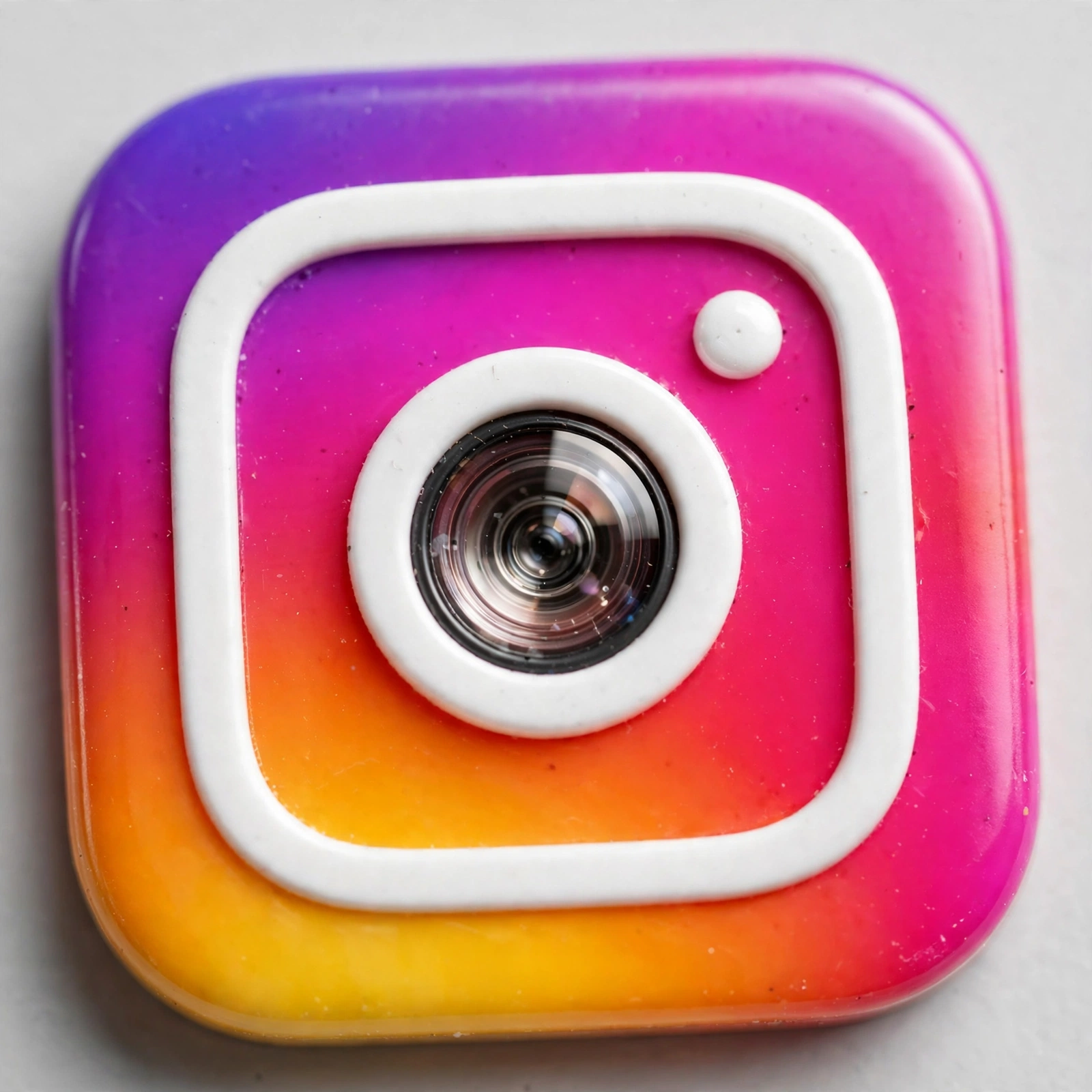
The Instagram logo is a minimal white camera outline drawn inside a rounded square filled with a violet-to-orange gradient. The square stands for the app icon itself, the circle in the center is the camera lens, and the small solid dot in the upper-right corner is the viewfinder. That is the whole symbol. Three strokes and a dot, reduced from what used to be a highly detailed illustration of a vintage instant camera.
The name behind the mark comes from combining “instant” and “telegram,” which described the original idea of the app: share photos as fast as sending a message. Kevin Systrom and Mike Krieger launched Instagram in October 2010 as a mobile-only photo app, and the camera was the only symbol that made sense for it. Facebook acquired the company in 2012, and it now sits inside Meta Platforms, but the camera has survived every redesign because it still points at the platform’s core: visual content, from photos to Reels and Stories.
Two things make the logo unusual compared to most brand marks. First, the Instagram wordmark almost never appears next to the symbol; the glyph alone carries the brand, which is rare for a company this large. Second, the official logo ships in two families: the full-color gradient version used as the app icon, and flat monochrome versions in black or white for press, partner pages, and situations where color printing is not possible.
The Anatomy of the Current Instagram Logo
Look closely at the glyph and it breaks into five parts, each inherited from a real camera component:
- The rounded square: the camera body, simplified from the 2010 Polaroid-style rectangle. The rounded corners keep it friendly and help it read as an app icon at tiny sizes.
- The central circle: the lens. In the 2016 redesign, Instagram’s design team reduced the old three-dimensional lens, with its gloss and blue tint, to a single white ring.
- The upper-right dot: the viewfinder. It is the smallest element, but it is the detail that separates the mark from a generic rounded-square-and-circle graphic.
- The gradient fill: the background that flows from yellow through orange and pink into violet. It replaced the beige-and-brown leather palette of the old skeuomorphic icon.
- The white line work: every stroke is white, which is why the flat monochrome versions invert cleanly into black-on-white or white-on-black without losing recognition.
That reduction was deliberate. The head of Instagram’s design team explained at the time that a realistic rendered camera could not scale down to favicon size or stretch across billboards without losing detail. The glyph solves both ends: it stays legible at 16 pixels and recognizable at 16 feet.
What the Instagram Logo Means
The meaning is straightforward, but the layers behind it are worth knowing. At the surface level, the camera says the platform is about capturing and sharing moments. That message has stayed true even as Instagram grew from filtered photos into Reels, Stories, live video, and messaging, because every one of those formats starts with the camera.
The gradient carries the second layer of meaning. The old logo’s rainbow stripe did not vanish in 2016; it was absorbed into the background. Purple suggests creativity, pink suggests warmth and energy, orange and yellow suggest optimism and brightness. Together they read as diversity and movement, which is exactly how Meta wants the platform positioned: not a single community, but millions of different feeds flowing into one feed.
There is also a practical meaning in how the logo is used. Because the glyph works without any text, it functions like a flag for the whole Instagram ecosystem. Creators who polish their profiles, often with help from guides like classy captions for insta, treat the logo as the visual anchor of their brand: the same mark appears on their profile, their watermark, and their promotional posts, so followers recognize them instantly wherever they show up.
Instagram Logo History: The Full Evolution From 2010 to 2026
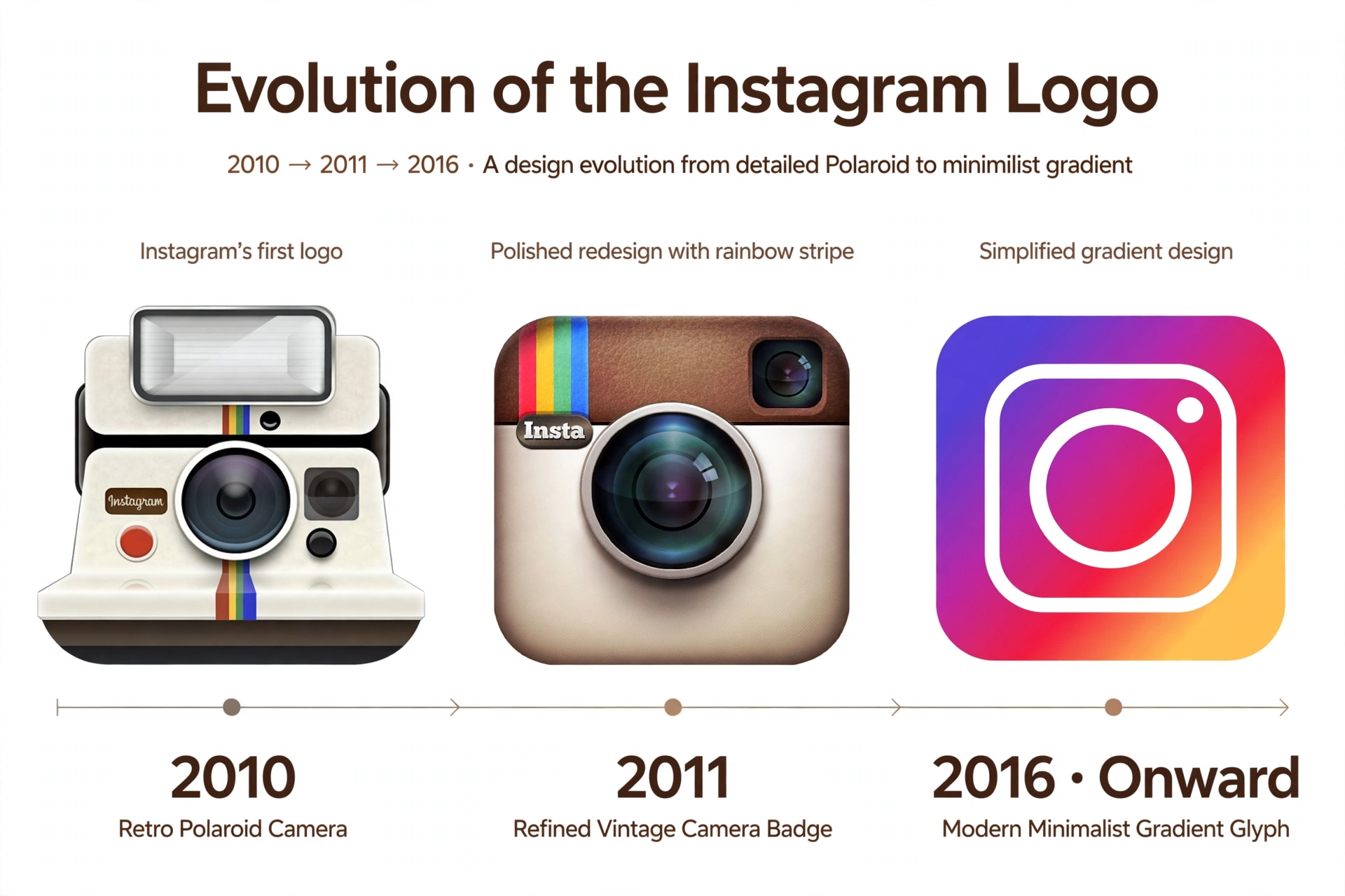
The Instagram logo has been redesigned more times than most people remember. The current gradient glyph is actually the fifth major icon, and the wordmark has changed six times, most recently in 2026. Here is how each version looked and why it changed.
2009 to 2010: The Burbn Wordmark
Before Instagram existed, Kevin Systrom’s location-based app was called Burbn. Its logo was only a wordmark in a custom lowercase cursive style. There was no camera, no icon, just the name. When the team pivoted to photo sharing, the Burbn identity was scrapped entirely.
2010: Systrom’s Polaroid Camera
Systrom designed the first Instagram icon himself, modeling it on a Polaroid instant camera. It had a detailed lens, a rainbow stripe running down the middle, a flash, shutter buttons, and a beige-and-brown body. It looked almost photorealistic by today’s standards. The design worked because it told users exactly what the app did at a glance, but it lasted only a few months before the team wanted something more polished.
Late 2010: The Cole Rise Redesign
Systrom brought in designer and photographer Cole Rise to refine the badge. Rise kept the camera concept but based it on the Bell and Howell camera from the 1950s, a boxier and more iconic shape. The rainbow moved to a vertical flag in the upper-left corner, and the word “INST” appeared beneath it in uppercase sans-serif. Legend has it that Rise finished the redesign in about 45 minutes. This version gave Instagram its first truly memorable mark and stayed through the app’s explosive early growth.
2011 to 2016: Refinement Years
For five years Instagram kept the Rise camera and polished it instead of replacing it. The camera body gained a leathery texture, the lens picked up gloss and depth, a blue tint appeared in the glass, and the “INST” lettering changed to a serif “Insta” with the rainbow widened and made more prominent. Each tweak made the icon feel more premium on the increasingly sharp phone screens of the era, without asking users to relearn the brand.
2016: The Big Redesign
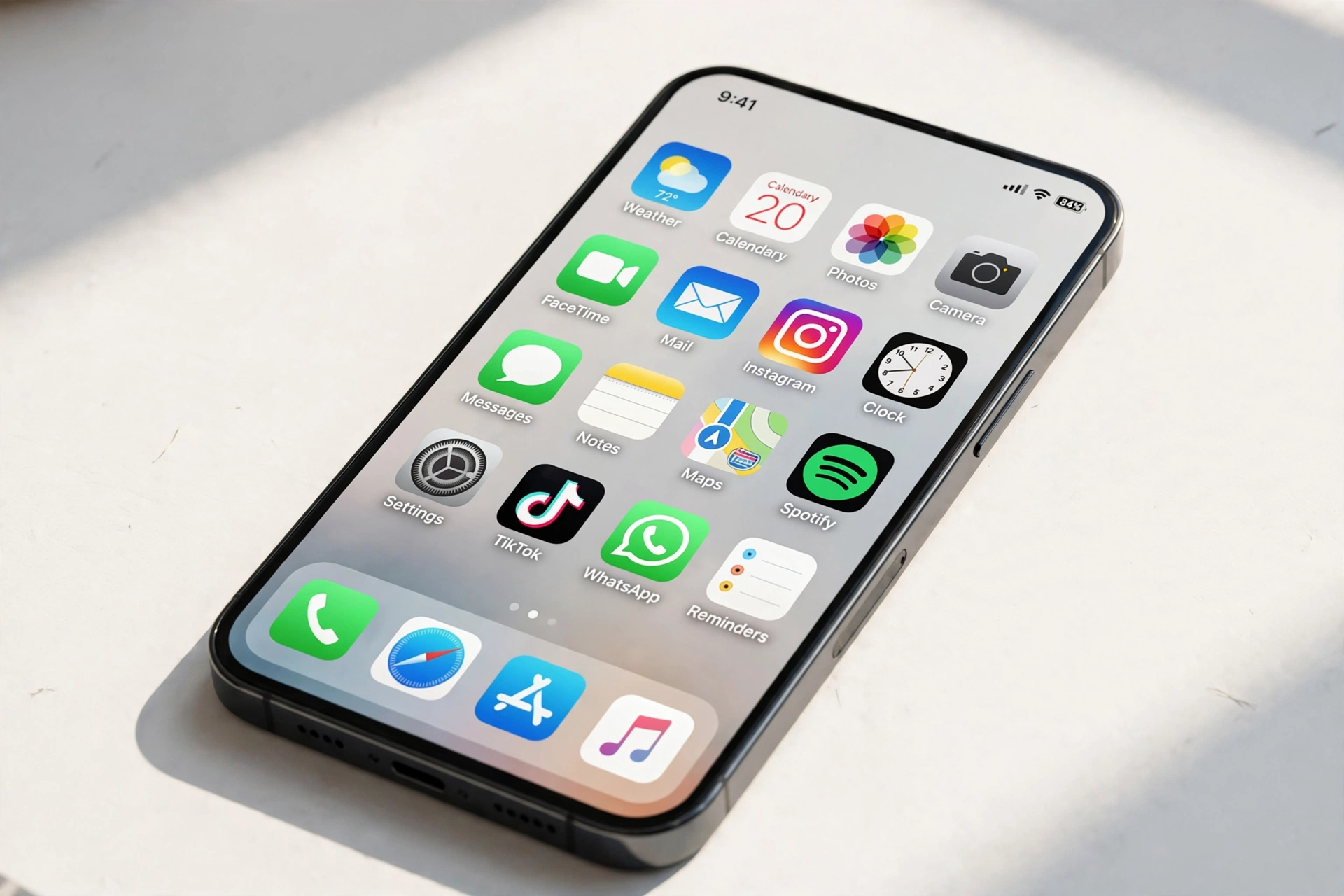
The 2016 change was the most dramatic in Instagram’s history and the most controversial at the time. The detailed retro camera was replaced overnight with the flat abstract glyph: a rounded square, a white camera outline, a central circle, and the viewfinder dot, all on a gradient flowing from yellow to orange to pink to violet. Instagram’s design team said the old rendered camera was a weak base for an icon system that had to scale from favicons to billboards, and that the glyph gave the mark the character and flexibility the brand needed as it moved beyond filtered photos into Stories, live video, and business tools. Public reaction was loud, with many users mourning the old camera, but within a year the gradient glyph was one of the most recognized app icons in the world.
2022: The Gradient Refresh
In 2022 Instagram did not change the shapes at all; it only repainted them. The gradient became brighter and more vibrant, leaning into lighter oranges, pinks, and purples, and the interface got matching gradient accents. It was a tune-up rather than a redesign, proof that the 2016 structure was strong enough to carry small refreshes instead of starting over.
2026: The New Wordmark
In August 2026 Instagram updated its wordmark for the first time in roughly a decade. The familiar handwritten script was replaced with a cleaner custom letterform that keeps handwritten touches, like the stylized “s” and flowing “g,” inside a more geometric structure. Head of Instagram Adam Mosseri described it as cleaner and more modern. The glyph itself did not change. Reaction was mixed, with jokes online that the new lettering reads as “Instagzam,” but the camera symbol’s equity carried the brand through the update untouched.
Timeline at a Glance
| Period | Logo Style | Key Change |
|---|---|---|
| 2009-2010 | Burbn wordmark | Lowercase cursive, no icon |
| 2010 | Polaroid-style camera | Designed by Kevin Systrom, rainbow stripe |
| 2010-2011 | Cole Rise redesign | Bell and Howell inspiration, “INST” lettering |
| 2011-2016 | Refined camera | Leather texture, glossy lens, “Insta” serif |
| 2016-2022 | Gradient glyph | Flat abstract camera, pink to violet gradient |
| 2022-2026 | Refreshed gradient | Brighter, more vibrant colors |
| 2026-present | New wordmark | Geometric custom lettering, glyph unchanged |
What Designers Can Learn From the Instagram Logo Evolution
Instagram’s logo history is a practical case study in brand evolution. The first lesson is continuity: every version kept the camera, so users never had to relearn what the brand stood for, even when the rendering changed completely. The second lesson is simplification for scale: the 2016 team traded detail for a glyph that works at favicon size and on billboards, which matters now that logos live everywhere from watch faces to TV screens.
The third lesson is color as identity. When Instagram dropped the realistic browns, the gradient became the personality of the brand, and the 2022 refresh showed that color alone can carry a rebrand without touching the shapes. Many creators who study branding apply the same thinking to their own pages, sometimes with the help of an instagram story downloader to repurpose their best visual content, or an anonymous instagram viewer to quietly study how top accounts present their brand. The principle is the same: keep the core symbol stable and let the supporting details evolve.
Instagram Logo Colors: The Gradient Explained
The official gradient flows through five stops: a deep violet, purple, pink, orange, and yellow. White is reserved for the glyph line work, and the flat monochrome versions use pure black or pure white. Instagram introduced the multicolor blend in 2016 and brightened it in 2022, and the flow direction runs diagonally, which is why the yellow corner and the violet corner look different on the app icon versus the marketing graphics.
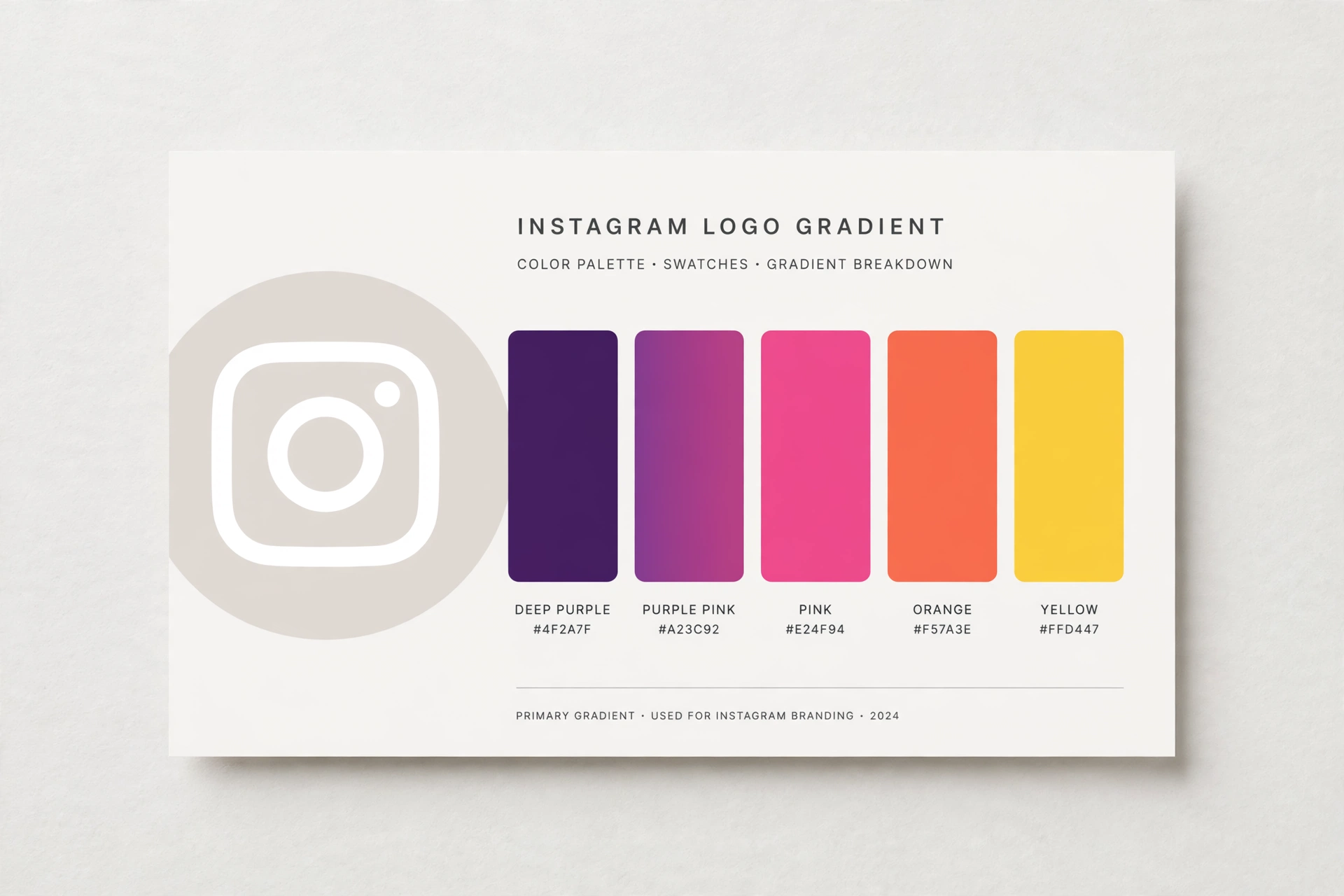
Each color was chosen for what it communicates. Purple has long been associated with creativity, pink with warmth and energy, orange with friendliness, and yellow with optimism. Blended, they keep the rainbow identity of the original 2010 logo alive in abstract form. For designers recreating the gradient, the practical takeaway is to use at least four to five color stops rather than a simple two-color fade; that richness is what makes the Instagram gradient instantly recognizable.
How to Download the Instagram Logo PNG (The Safe Way)
Plenty of sites offer an Instagram logo PNG with a transparent background, but the only safe source is Meta itself. Here is the correct process:
- Go to Meta’s official brand resources page. Meta publishes brand assets for Instagram, Facebook, WhatsApp, and its other apps in one place. Search for “Meta brand resources” and open the official result.
- Accept the brand guidelines. Meta asks you to agree to its brand usage terms before downloading. Read them; they are short and they define exactly what you may and may not do with the files.
- Download the approved asset pack. The pack includes the gradient glyph, the monochrome versions, and the wordmark in PNG and vector formats at the correct proportions. These are the only versions Meta considers official.
- Do not redraw or recolor the logo. The guidelines require the official files to be used as-is. Stretching, recoloring, adding drop shadows, or placing the glyph on a busy background all violate the terms.
Downloading a random PNG from a logo gallery site is common, but those files are often outdated, low resolution, or slightly wrong, with the wrong gradient direction or rounded corners that do not match the official geometry. For anything public, like a client project or a printed banner, the official pack is the only version worth using.
Instagram Logo Usage Rules and Trademark Caution
The Instagram logo is a registered trademark of Meta Platforms, and its use is restricted in ways that surprise many people. The short version of the rules:
- You may use the logo to show that your business has an Instagram presence, for example a “Follow us on Instagram” button on your website, as long as you follow the brand guidelines.
- You may not use the logo in a way that suggests endorsement, partnership, or sponsorship by Instagram or Meta unless you actually have one.
- You may not make the logo the most prominent element of your own branding, and you may not combine it with your own logo to create a merged mark.
- You may not use the logo on merchandise for sale without written permission from Meta.
- Never alter the logo’s colors, proportions, or spacing, and never animate it in ways that distort the mark.
These rules apply whether you grabbed the file from Meta’s brand page or anywhere else. Trademark protection does not depend on where you downloaded the image. When in doubt, the monochrome version is usually the safest choice for editorial and informational use, and commercial use always deserves a second look at the current guidelines.
How to Use the Instagram Logo on Your Profile and Website
For creators and small businesses, the logo’s real job is recognition. Place the official glyph next to your Instagram handle in your website footer, your email signature, and your Link in Bio page so visitors connect your brand to your account in one glance. Keep clear space around the mark at least equal to the height of the viewfinder dot, and never let text or other icons touch the glyph.
On Instagram itself, the logo works best as a profile watermark or a highlight cover rather than a profile picture, because followers expect to see a face or a brand mark that is uniquely yours. A strong visual identity is one of the quiet factors behind accounts that grow steadily, which is why creators studying how to increase instagram followers usually start with consistent branding before they worry about posting frequency. Readers who run modified Instagram clients often check the InstaUp APK guides on this site as well, since extra features change how profiles and logos display inside the app.
Frequently Asked Questions
What does the Instagram logo mean?
It is a simplified camera: the rounded square is the camera body, the central circle is the lens, and the small dot is the viewfinder. The gradient background represents creativity, diversity, and energy, carrying forward the rainbow stripe from the original 2010 logo.
Who designed the Instagram logo?
The first 2010 icon was designed by co-founder Kevin Systrom. Designer Cole Rise redesigned it later in 2010, basing it on a 1950s Bell and Howell camera. The 2016 glyph redesign was led by Instagram’s in-house design team, and the 2026 wordmark update was announced by head of Instagram Adam Mosseri.
When did Instagram change its logo?
The major icon change happened in May 2016, when the detailed retro camera became the flat gradient glyph. The gradient was brightened in 2022, and the wordmark was redesigned in August 2026. Earlier icon updates happened in 2010 and 2011.
Can I download the Instagram logo PNG for free?
Yes, through Meta’s official brand resources page, which provides the approved PNG and vector files. Random logo gallery sites also offer PNGs, but those are often outdated or inaccurate, so the official pack is the safer choice.
Is it legal to use the Instagram logo on my website?
Generally yes, if you use it only to indicate your Instagram presence and follow Meta’s brand guidelines. You may not imply endorsement, alter the mark, or use it on products for sale without permission. Commercial uses should always be checked against the current guidelines.
Conclusion
The Instagram logo went from a hand-drawn Polaroid camera in 2010 to one of the most copied gradient glyphs in design history, and it did it without ever dropping the camera at its center. The 2016 redesign proved that ruthless simplification can strengthen a brand, the 2022 refresh showed that color alone can carry an update, and the 2026 wordmark change confirmed that the glyph itself is now untouchable. Whether you need the official PNG for a project, want to understand the color symbolism, or just wanted the full story of how the icon evolved, you now have the complete picture, along with the safe, trademark-respecting way to use the mark yourself.